How to write a soft and cheerful "い" in hiragana?【Study Japanese Calligraphy】
Hi, I am "Teto".
This is Japanese calligraphy course that enables anyone to learn to write beautiful Japanese characters!
In this article, I will explain how to write the "い" in hiragana beautifully.
The "い" is not as complicated as the "あ"!
Therefore, for beginners, it may be a good idea to start practicing with "い".
Please refer to the video!
It's in Japanese, but my video add furigana(phonetic characters placed above kanji),
so you can use it to study Japanese!
Overview of "い"
The "い" consists of two vertical curves.
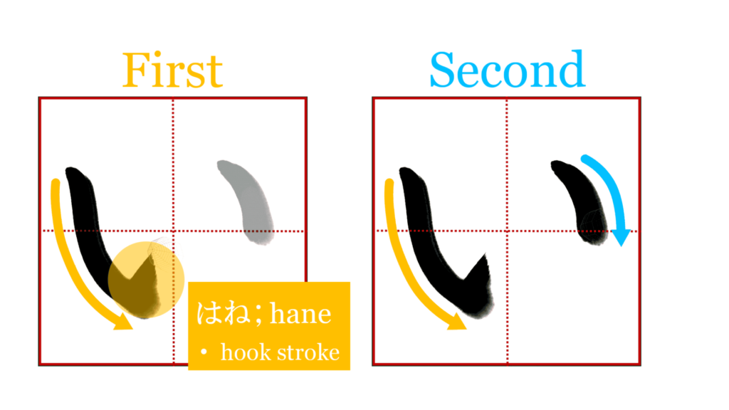
The last movement of the first stroke is "はね"(hook stroke).
It is very important that the two lines facing each other softly correspond to each other.
As mentioned in the explanation of "あ", the beauty of curved lines is very important in hiragana.
The "い" should not be written simply as a straight line, but should be written softly so that it bulges outward, giving a cheerful and soft impression.
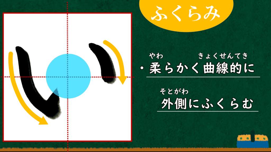
In the image above, a circle is placed between the first and second strokes.
As you can easily see, the space between these strokes should be wide!
This will give the character more space and room to breathe.
These are the overview points.
I will now explain more detailed points.
筆脈(hitsumyaku;brush vein)
Do you know what "brush vein(筆脈, hitsumyaku)" is?
(The best English translation for "筆脈" could not be found.)
Brush vein" is defined as "the consciousness of connecting one brush stroke to the next without breaking off.
It is the most basic of the basics of calligraphy, it is important to keep the brush vein in mind.
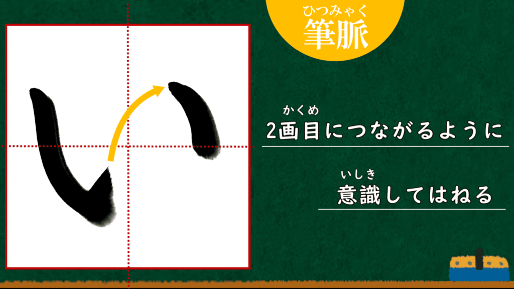
The first hook stroke should not be a random stroke, but should be connected to the second stroke to create cohesion within a character.
What would happen if you did not pay attention to the brush vein?
Let's compare this with a bad example.
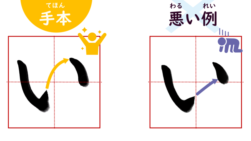
If you are aware of the brush vein, the character will look more natural and beautiful because there is no interruption
はね;hook stroke
Now you know that you should be aware of the brush vein when you make a hook stroke, right?
Next, I will explain how to make a beautiful hook stroke.
Please take a look at the four images below.
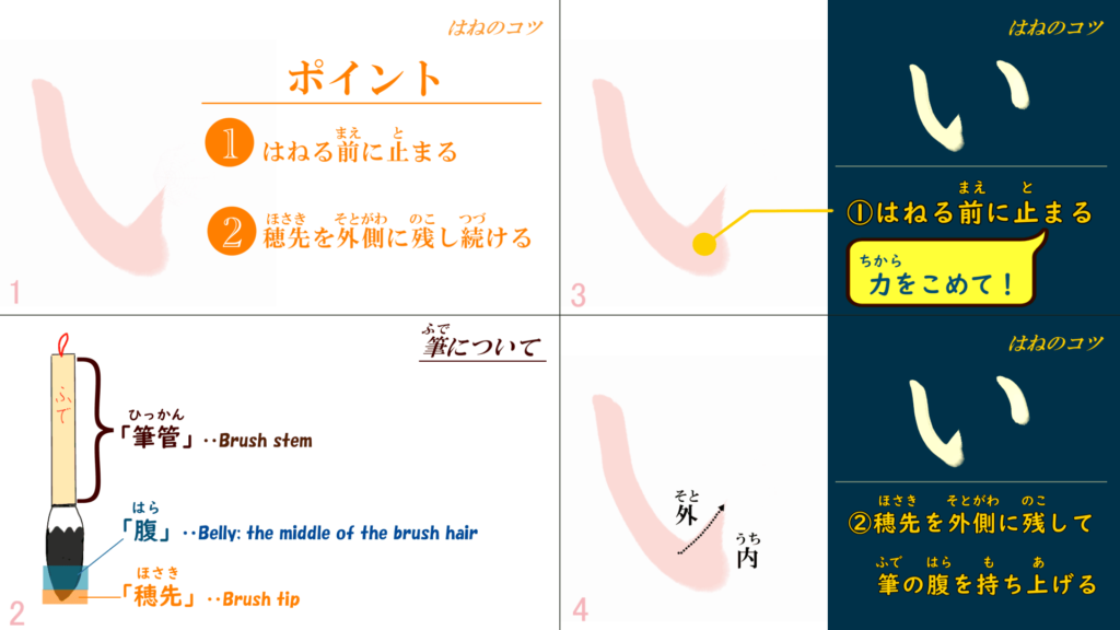
There are two key points.
First, before hook stroke, stop with force.
This "putting force" action is very important.
In hook stroke, the force you put in when you stop converges beautifully by gradually releasing it in a divergent manner.
Therefore, if you try to splash without stopping properly, or if you do not apply force, it will not go well.
(Of course, too much force is not good either.)
I know it's hard until you get the hang of how much pressure is optimal.
But, as you practice with awareness, there will come a time when you will get the feel for it, so keep practicing!
The second point is to continue to leave the brush tip on the outside during hook stroke and gradually lift the belly of the brush.
(The brush tip and belly are the regions of the brush. Please refer to above image).
This is also an important point for "falling stroke"(はらい).
If you lift the brush in an instant, you will not get nice, sharp lines.
The brush tip should remain in contact with the paper until the very end, while the belly of the brush should gradually separate from the paper.
The difference between falling and hook stroke is that the hook stroke uses the force exerted when the brush stops.
The characteristic of the hook stroke is that it is made to advance quickly with a little momentum.
Therefore, hook stroke gives a powerful impression.
For more information on how to write the falling stroke well, please refer to the first part of the explanation of the "あ"!
The course on how to write the "あ" in hiragana beautifully【Part 1】
A Japanese calligraphy course that will help anyone become proficient in Japanese hiragana! This time, I will explain how to write "あ" well! In the first part…
The second stroke
There are two points for the second stroke.
The first is the position of the starting stroke.

The position of the start of the second stroke of "い" varies from person to person.
Therefore, although this is not an absolute rule, it is best to align the height of the first stroke with that of the second.
(Some people teach it a little higher than the first stroke, so please follow the instructions of your school or calligraphy class.)
The second point is the length of the second stroke.
Remember, the second stroke is much shorter than the first!

That's all for the "い" explanation.
Finally, if you are interested in learning more about calligraphy after reading my explanation, I highly recommend that you visit a calligraphy class.